Art is an integral part of the EcoCertified story. Having the right images- and language- to support our growers in communicating their dedication to sustainable growing practices in a way that is not only easy for consumers to relate to but also brief enough to fit on produce containers has been an ever-evolving process which has culminated in our new EcoCertified logo. Although, the search for the best packaging continues.
The Beginning: “Born and Raised Here”
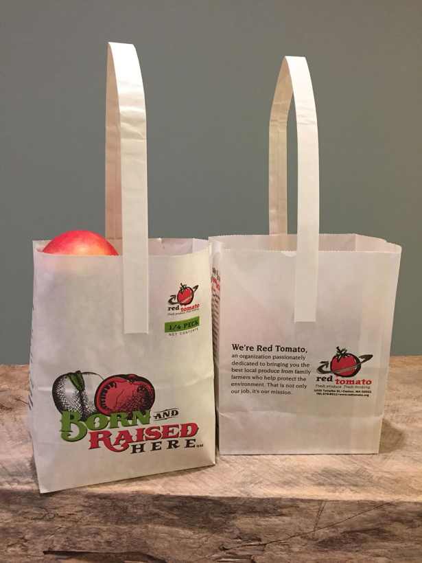
In the beginning, there was the Born and Raised Here campaign. Even then, our mission was to support regionally appropriate local.

The Eco Apple Program
In 2005, Red Tomato launched the Eco Apple program. This was the predecessor of today’s rigorously science-based protocol used by EcoCertified growers. Red Tomato hired a famous illustrator, Anthony Russo and he generously created a series of farm illustrations for us to use. This first tote bag, which appeared in a national supermarket chain had Anthony’s artwork on it.
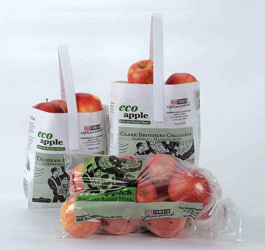
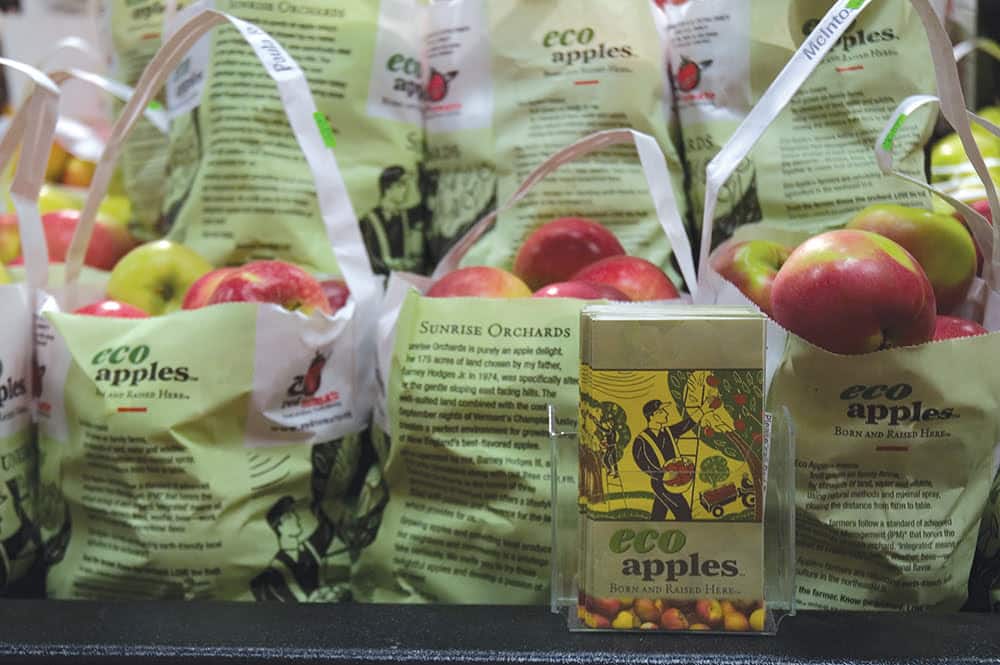
Local Done Right!
Red Tomato’s logo was redesigned in 2014. And, to ensure the Eco Apple program stayed as fresh as its name, that logo was also updated and given the tag line “Local Done Right!” in 2015. The team at Red Tomato felt the two images should complement each other and so, the same color and font scheme was chosen.


Whole Foods Partnership
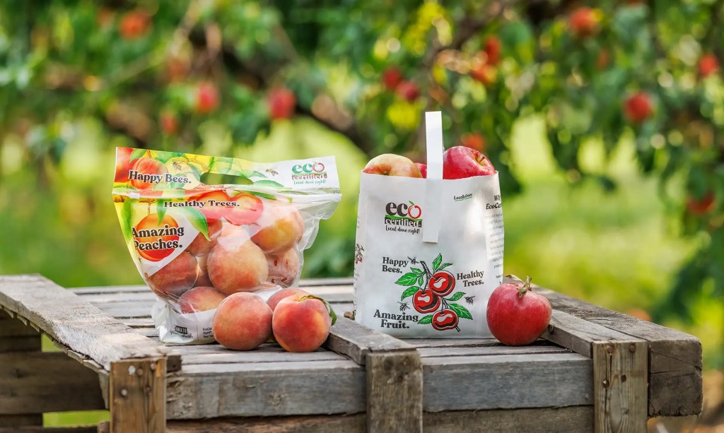
When Red Tomato partnered up with Whole Foods to sell Eco Certified peaches and apples, another redesign was necessary. Since we could now use our logo on pouches that would be displayed amongst other pouches, all in color, we came up with a more fresh and earthy look for the design. This added more life to the apple or peach graphic.


The New EcoCertified® Logo
The new EcoCertified® logo was developed earlier in 2022 with a stronger focus on sustainable growing practices, caring for the land, supports soil health, innovation and the ability to respond to change.
